Example 6C: Exploiting some of JOA’s Mapping Features
The JOA mapping function, together with JOA’s calculation and interpolation functions, provides a wide range of options that can be exploited to illustrate oceanographic features. These options will be useful for exploring the data sets for each ocean we will use for DPO Chapters 9-13.
For the next three JOA DPO Examples we will use the JOA data file WOA05_NorthAtlantic_square.joa, which is an areal subset of the very large WOA05 1-degree World Ocean data set. WOA05_NorthAtlantic_square.joa is itself a large data file, but except for older computers with little RAM it should not over-burden most computers.
Files that may be needed or created in this example:
WOA05_NorthAtlantic_square.joa
ROSE-black_cbr.xml
Available from the JOA Application page under “Support Files”. After downloading, copy to the “JOA_Support” folder included with the JOA application.
Exercise 6c-01:
Start JOA
File → Open… → WOA05_NorthAtlantic_square.joa
Plots → Map…
Set up the General Settings panel of the Configure Map dialog box as shown below:
Note
Due to a JOA quirk which may linger in the version included with these DPO JOA Examples, even though you will be setting custom map boundary limits, it is still necessary, after selecting the Orthographic Projection, to:
Next click on one of the Preset Regions, in this case the “North Atlantic” choice under “Select Map Region”
Then click on and type in the Custom Region “T” (top), “B” (bottom), “L” (left), and “R” (right) latitude and longitude limits.
[Yes, it’s a JOA bug, but one which has been elusive to repair.]
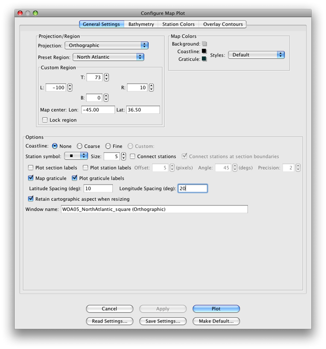
Fig 6c-01 General Settings panel of the Configure Map Plot dialog box
In the Bathymetry panel (as shown below), the etopo20.nc bathymetry file will give a pleasing appearance to land masses, and together with the ROSE-black_cbr.xml colorbar will yield all-black land masses without providing any bathymetry shading. (As you will see soon, there is no reason to add ocean bathymetry shading to this plot.)
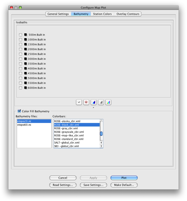
Fig 6c-02 Bathymetry panel of the Configure Map Plot dialog box
When you click on Plot, you will get this somewhat odd-looking map plot (as shown below):
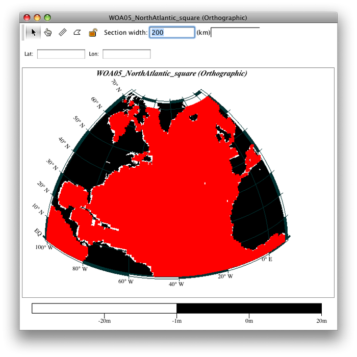
Fig 6c-03 Orthographic plot
If the ocean areas on your map, like the one above, have the appearance of being a single solid color, the reasons for this are:
We made the individual station markers square and size 5,
The data are on a 1-degree grid, and
We used a map projection which provides a modest allowance for the Earth’s spherical shape.
The station symbols would spread apart at high latitudes with a Mercator or Miller projection, but they keep more nearly in proportion with the Orthographic projection.
JOA provides the capability of coloring the individual station symbols on a map plot by the values of observed or calculated parameters. When this capability is applied to a gridded data set, such as the one here, the result is, essentially, a map plot of the characteristic used to color the station symbols.
For example, to modify the plot above bring up the Configure Map Plot dialog box:
Double-click or control-click on the Map Plot, or type [ctrl/cmd]-R
Or type [ctrl/cmd]-R or Edit → Edit: plotname when the Property-Property Plot is the front-most window
From the Station Colors tab of the dialog box, select the Iso-surface value sub-tab, and set it up as shown below:
Under Parameter: choose SALT
For Surface: use PRES-0-6000_srf.xml
Use the SALT-global_cbr.xml color bar under Colors:
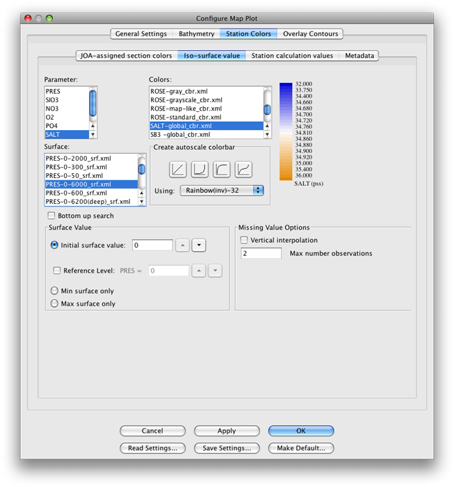
Fig 6c-04 Iso-surface value sub-panel of Station Colors panel of the Configure Map Plot dialog box
Click OK to produce the map shown below:
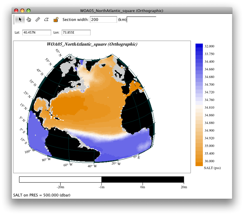
Fig 6c-05 Orthographic map
In the image below we have modified the original map - we show the 500 decibar surface instead of the original 0 decibar surface - using the procedure described in the Examine box below
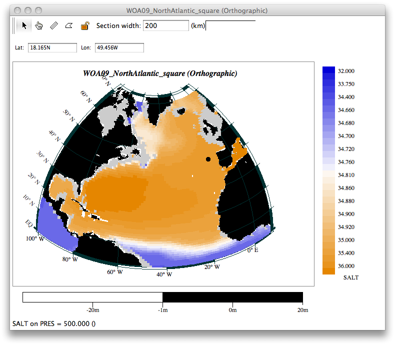
Fig 6c-06 Orthographic map 500 decibar surface
Examine
Java OceanAtlas Orthographic Map
This map is “live”, i.e. it is fully browsable. What do we mean by that?
Try using the “down” arrow key on your keyboard. With each tap on that key, the PRES surface onto which SALT is interpolated will go down the list of standard levels by one increment, and the station dots will be colored according to the value of SALT at that deeper level.
In the figure above, we have already keyed the map level down to 500 decibars, so the map shows the distribution of salinity in the WOA05 annual average data file at 500 decibars. The gray ocean areas show where there is no value of SALT at that level, in this case because the water there is shallower than ca. 500 meters.
You can see that with WOA05 data files, for each ocean region, you have in hand a powerful live “electronic atlas” for that region.
In the next three examples, we will color the individual station symbol squares based upon other observed and calculated parameters.